Palais Garnier, Paris, was designed in the late 1800s by the young, unknown, competition-winning architect, Charles Garnier. Because of the Palais Garnier’s wicked – and entirely appropriate – design drama I’d take this opera house (1875) any day over the tech-hygienic Bastille Opera House (1989), designed by another unknown, Canadian Carlos Ott. At Palais Garnier, the painted-canvas house curtain is a lush interpretation of a draped curtain, complete with gold braid and pompoms. The horseshoe-shaped auditorium has 1,900 red velvet seats on the orchestra floor, balcony and arranged in the private ‘loge’.

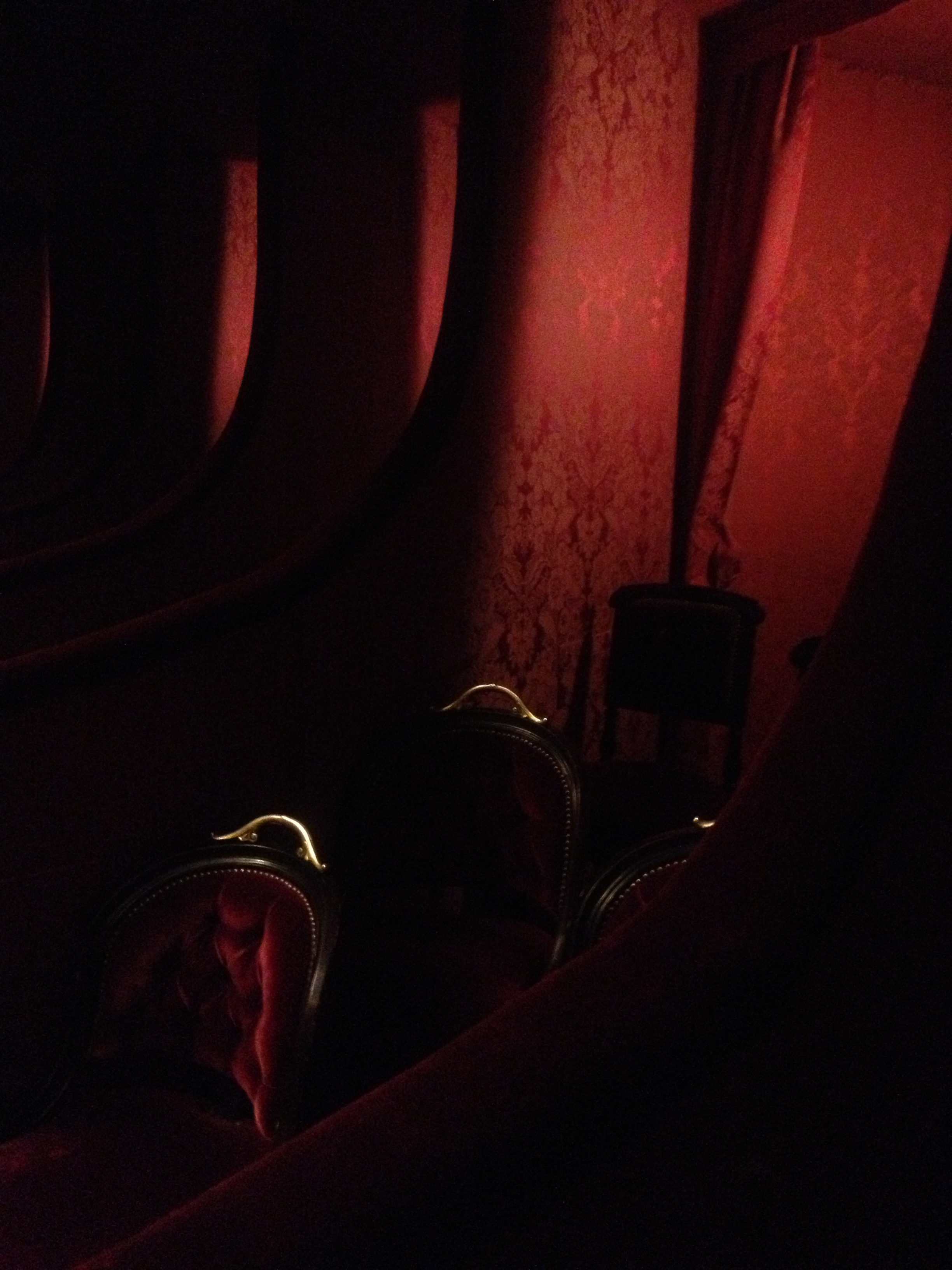
My favourite ticket: 1ere loge, Palais Garnier. Red velvet chairs that the Marquis de Sade would have thoroughly enjoyed.
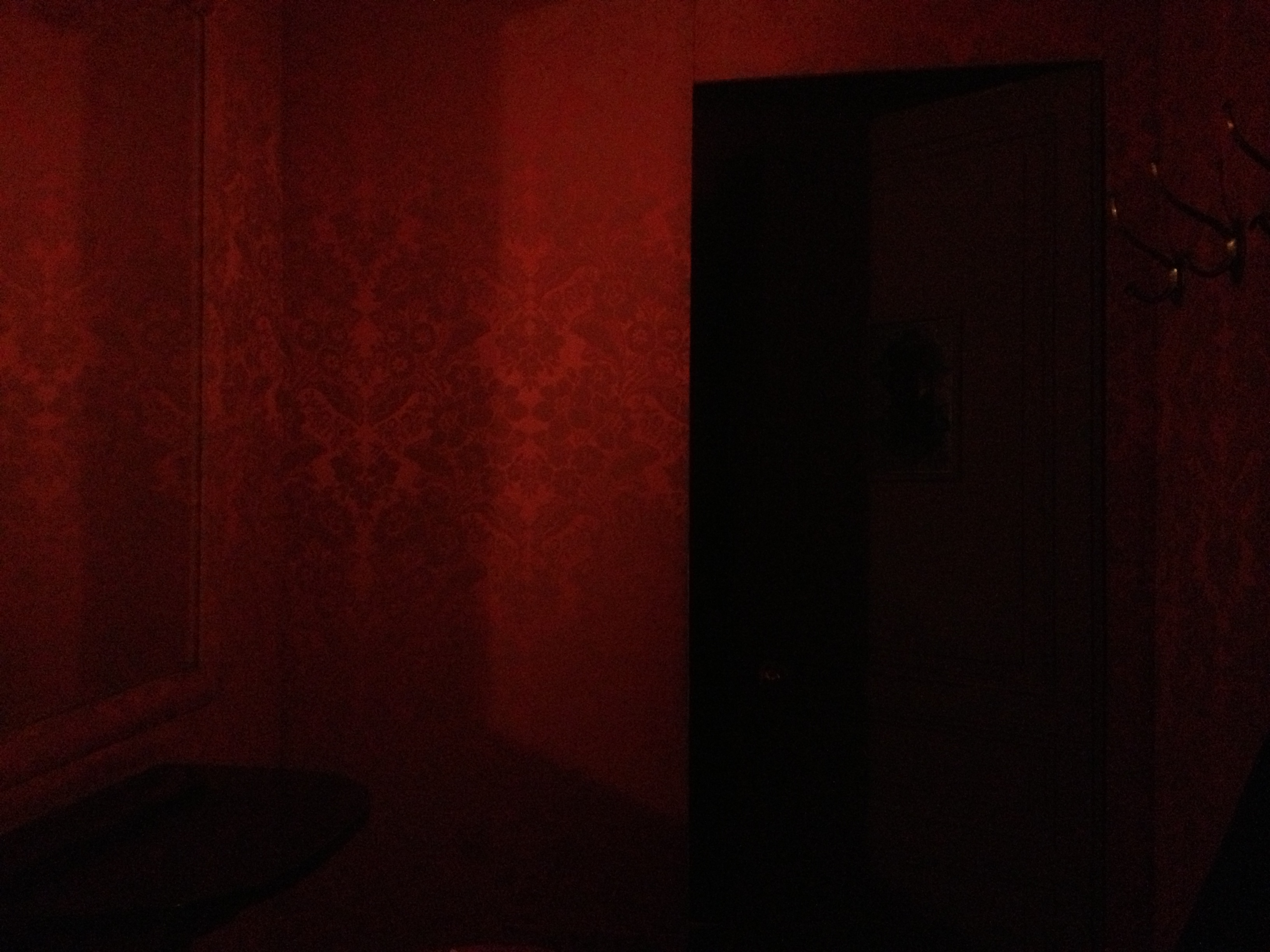
 1ere loge, anti-chamber. Framed behind red drapery, this private, intimate room comes with a mirror, a fold away table and a red velvet couch. If I could, I’d make my pied-a-terre apartment here as writer-in-residence.

Wall upholstery – dedication to the textures of red that the Metropolitan Opera in NYC only begins to explore.
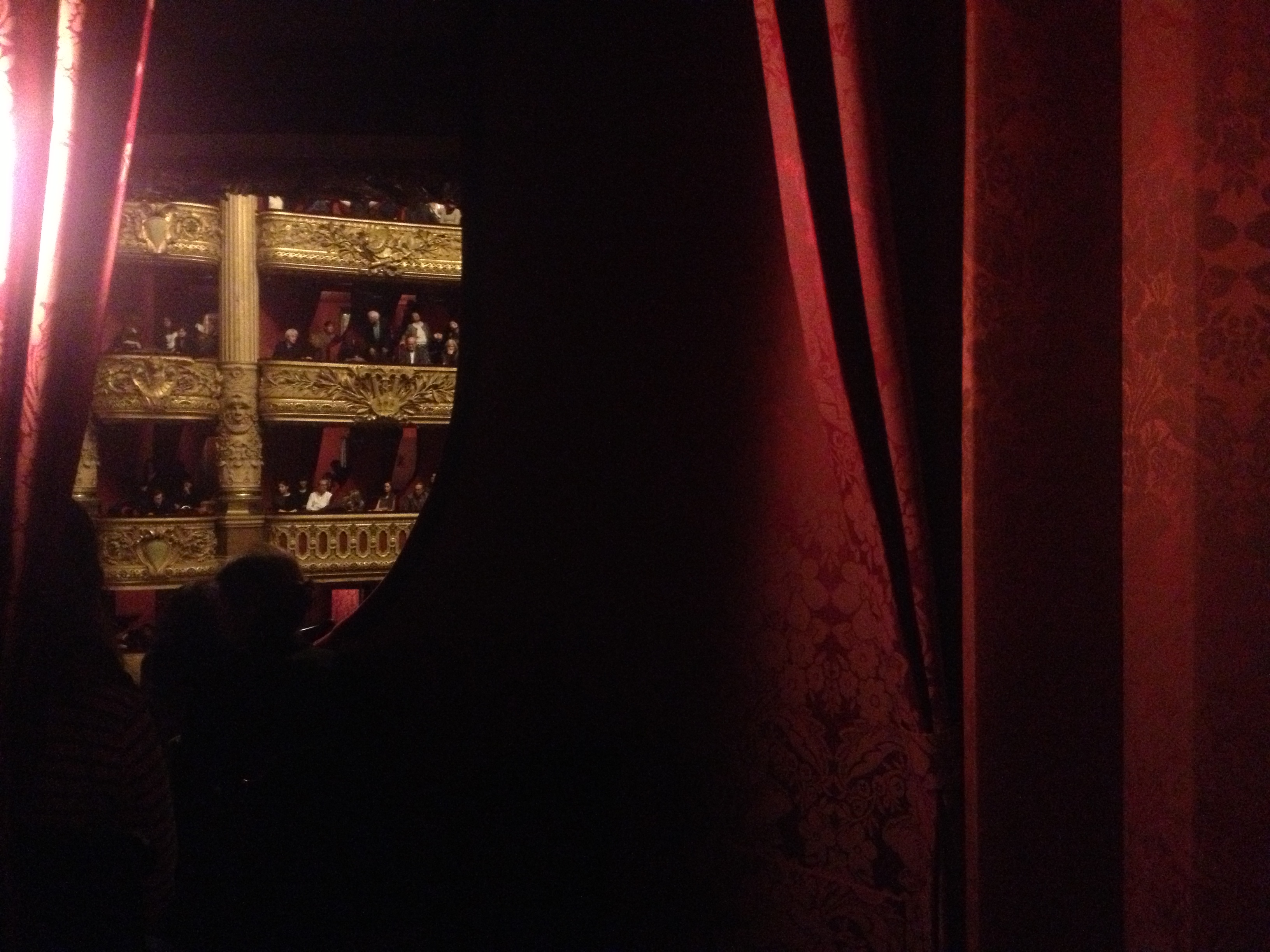
 Past the pleated drapery, looking out.
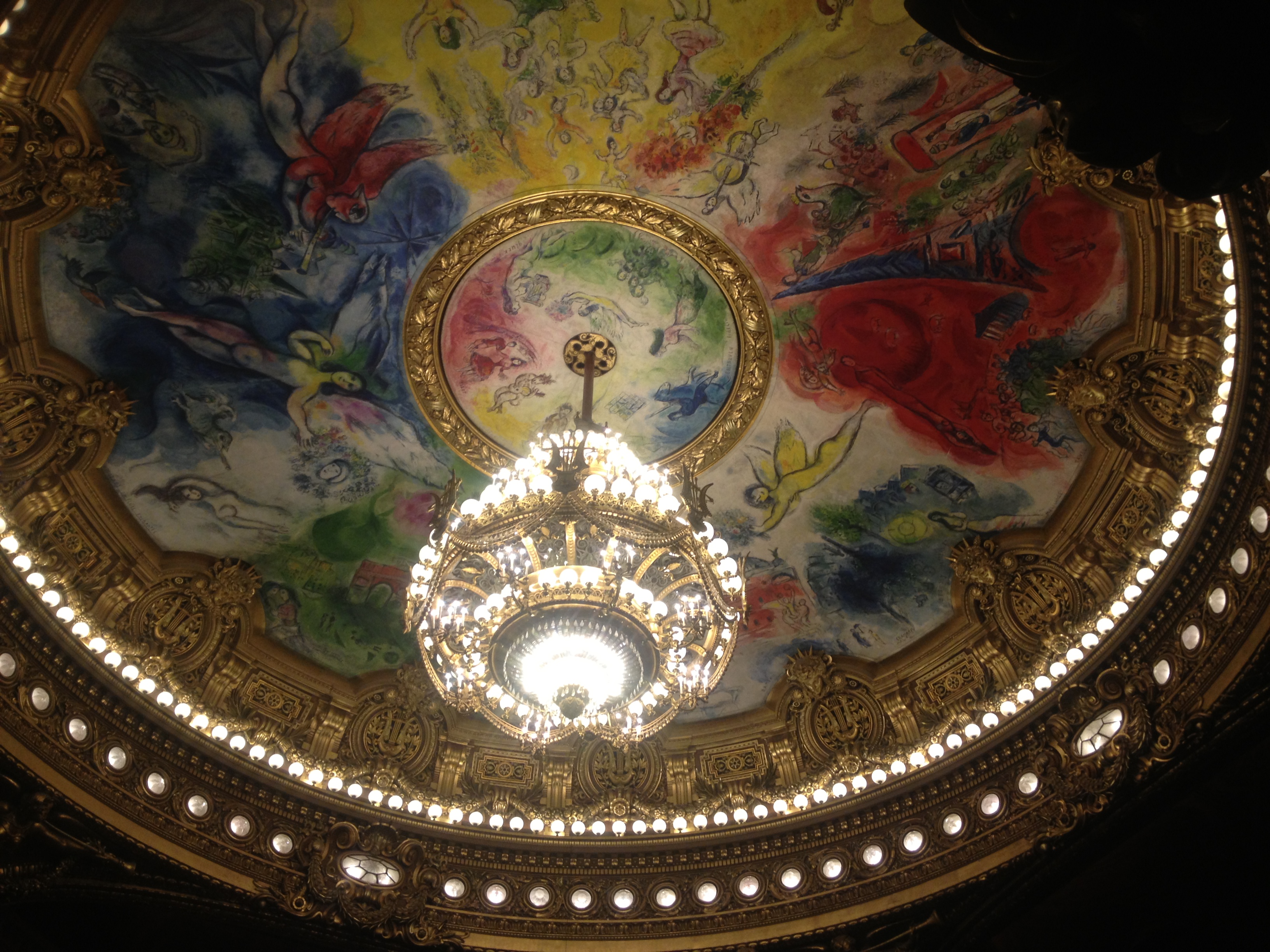
 Views up to the fantastic crystal chandelier and, for the reinvented dome, Chagall’s riot of colours, completed in 1966, nearly a century after Garnier made his epic design move.
 Ile Saint-Louis church poster on wooden poster board
 Grand creme, late afternoon lunch, at the ever venerable Les Deux Magots (1884).
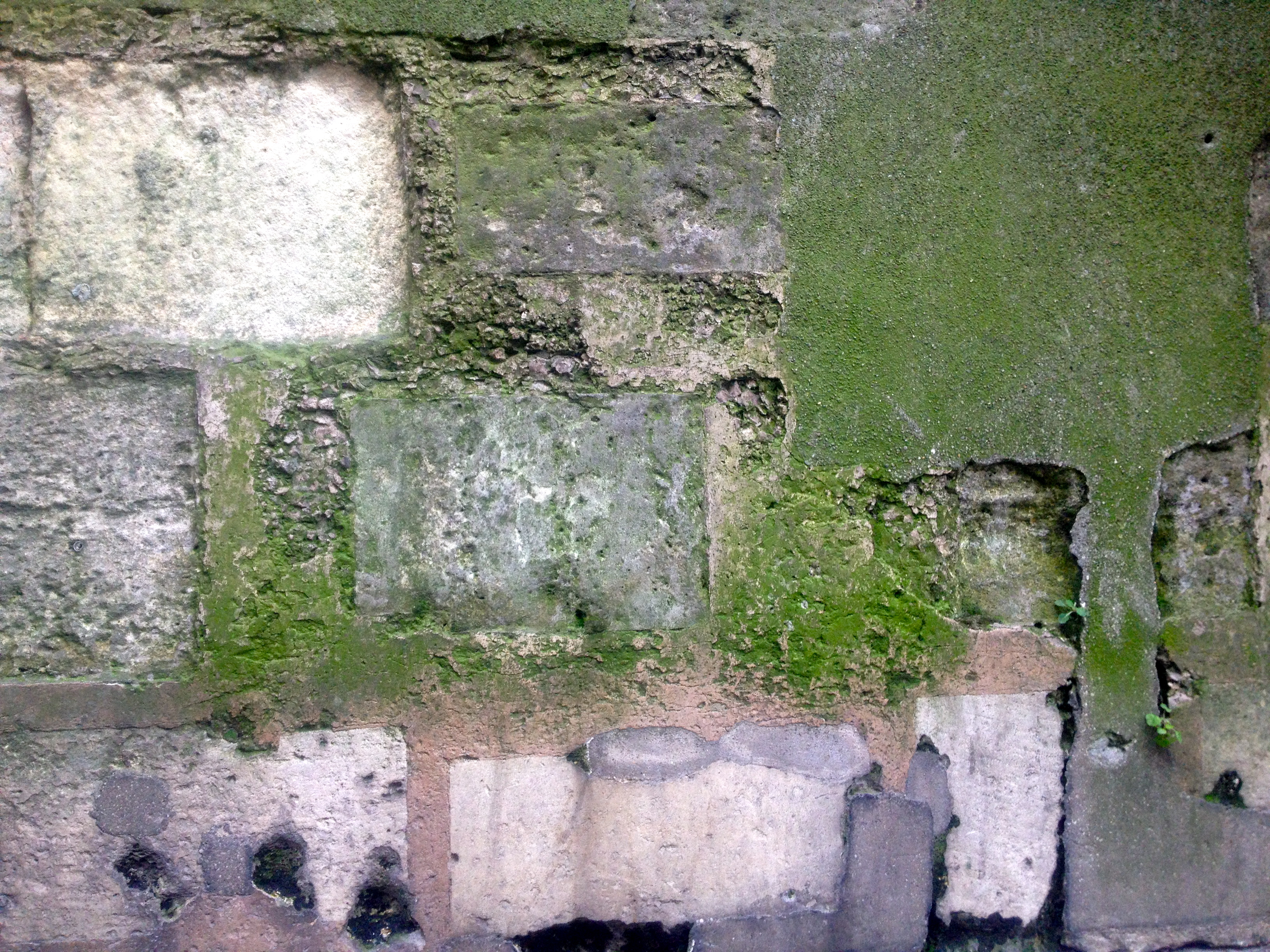 The passing of time, church foundation wall, Ile Saint-Louis.
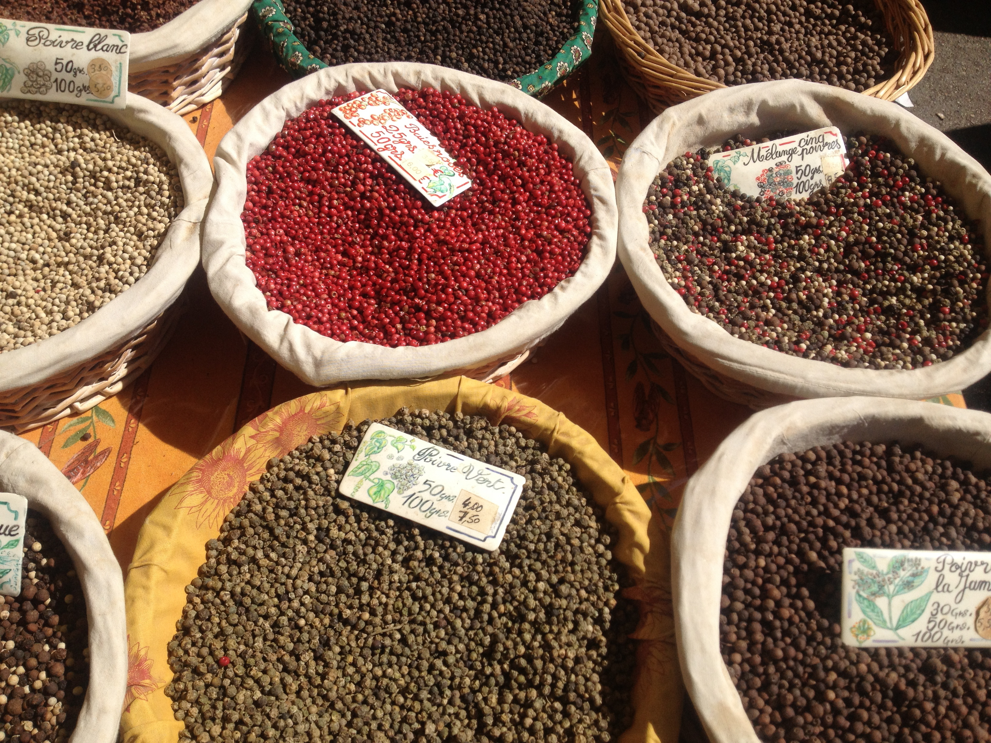 Spice and pepper stall, open-air spring market, Aix-en-Provence
 Lemons fresh from Spain at Aix market.